He who dares to teach
must never cease to learn.
John Cotton Dana, Librarian
Teaching Philosophy
Through my knowledge of different types of visual communications (written, print, digital, and motion) I aim to make a difference on issues that impact society and the communities we live in.
My first lesson in the importance of how design can inform came in the fourth grade when I designed my first piece. I got the job because of my penmanship and drawing skills. I remember gathering with building excitement all of the necessary materials: pencils, markers, rulers, glue, and glitter. After settling myself on the floor I wondered to myself, “How in the world am I supposed to start?”
After staring for some time at the large poster board lying before me, I felt a warm touch on my shoulder. My art teacher, leaned over and said, “Just remember to make sure that parents will be able to read this from far away. Other than that, make a poster that will make them want to attend.” After two hours of outlining my headline and artwork, I began the painstaking task of coloring my design in with markers. When the poster went up the next day I was elated and had a great sense of accomplishment and pride . . . I still get those same feelings today.
Many more lessons would follow which carried me down a path toward becoming a graphic designer. Now, even after so many years, I always go back to my first lesson, which taught me that design, even the simplest hand drawn “Back to School Night” poster, is all about communication.
I use all of my experiences and learning (good and bad) in the classroom today. Teaching design is all about providing the setting in which each student can make the connections between art, technology, business, attitude, and drive that will ultimately propel them down a successful career in visual problem solving. In return, I continually learn and grow in the career that I love. As Aristotle put it best, “Teaching [truly] is the highest form of understanding.” I hope one day to achieve that status! :)
GRAPHIC DESIGN PROGRAMS @ MASON
For the past several years I have been teaching as an adjunct professor of design at George Mason University. I have had the honor to teach many wonderful students that have gone on to amazing opportunities.
Mason is located in Fairfax, VA and offers a Bachelor of Arts (BA), Bachelor of Fine Arts (BFA), Master of Arts (MA), and Master of Fine Arts (MFA) in graphic design. They also have a graphic design certificate program available to students who already have a degree in another subject area. Select the link below to find out more information about George Mason’s graphic design programs.
There are nine basic elements and nine fundamental principles that I use as a starting point for my design thinking and teaching.
Why are the elements and principals so important?
Understanding these design building blocks and philosophies allows for thoughtful and skillful combination of these essential theories, as well as provides the designer the ability to maximize and minimize any of these parts to achieve truly creative results. This creative problem solving process allows the designer to consistently produce unique strategies that deliver solid design solutions.
The 9 Basic Elements of Design
Point

A point marks a position in space. It’s a pair of x, y coordinates. Graphically, a point takes form as a dot, a visible mark that can focus attention to one spot.
Line

A line is an infinite series of points. Understood geometrically, a line has length, but no breadth. Lines can organize, direct, separate, be expressive, suggest an emotion or create a rhythm.
Plane/Shape

A plane is a 2D surface area generated by connecting straight and/or curved lines. A plane can take on the form of any shape.
Volume

On a 2D application you can perceive 3D space or volume using color, transparency, layering, overlapping, and angles.
Color

Color is often described as hue. There is an entire science dedicated to the study of the effects of color and the sociological implications of color. Points, lines, and planes all have a color attribute.
Scale

A relationship between objects is often defined by their size or scale. This is often called proportion.
Texture

Texture defines a surface. Patterns and repetition can create textures. Texture adds detail to an image, providing an overall surface quality.
Transparency
Transparency creates dense, layered imagery built from layers of color and texture. It can contribute to the meaning and visual intrigue of a work.
Value

Value is the degree of lightness and darkness in an object and is related to color. It can give the design emotion. Line, color texture, and shape all need value in order to add depth.
The 9 Basic Fundamental Principles of Design
Balance
The division of visual space can be described as symmetrical or asymmetrical. Balance ensures that the parts of the composition are placed in an aesthetically pleasing way. Asymmetrical balance is more dynamic because it keeps the audience engaged on the visual message. Understanding how to balance all of the elements in a composition is vitally important in design.
Emphasis/Dominance

Emphasis or dominance is when an element in a composition draws the focus of the viewer to a certain area. You can emphasize color, value, shapes, illustrations/photography, and text. Usually emphasis goes hand-in-hand with how you direct or detract attention to an object by screening or framing certain parts of the composition.
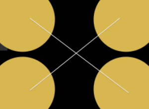
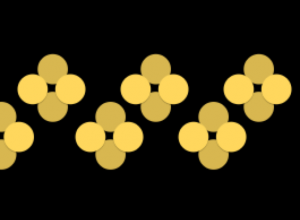
Rhythm/Pattern/Movement
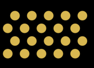
Pattern, sequence, flow, movement. All of these are create a rhythm in a composition. Movement is the way a designer leads the eye throughout a composition.
Unity
Unity is the relationships between elements. Unity is the harmony of the entire composition and also of its parts. It is the relationship among the elements of the composition that gives the sense of wholeness and it helps give the piece meaning.
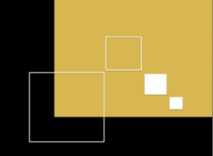
Figure/Ground

This is often referred to as empty space, or negative space. It is an element that can be used with the same force as positive space.
Contrast

Visual differences in elements using shape, scale, value, and/or color is described as contrast. Humans are wired to notice differences. Because of this, using contrast within your designs displays energy and helps draw attention particular parts of the composition.
Hierarchy

Hierarchy is the order of importance within a piece. Hierarchy gives the user a clear path of how you want them to flow into the design. It organizes the content and allows for quick recognition of the information you want to get out.
Framing and Layering
Framing is the use of images, words, and space to influence decision making and judgment by manipulating the way information is presented. Layers are simultaneous, overlapping components of an image of sequence. It is important to understand layering and how combining images, colors, shapes, and objects will do to a composition.
Grid
Grids are a network of lines that can encourage the designer to vary scale but have a well-structured piece. Grids provide organization, facilitate movement, and allows for a structure that simplifies information and provides greater function of content.
What to learn more? Try these books . . .
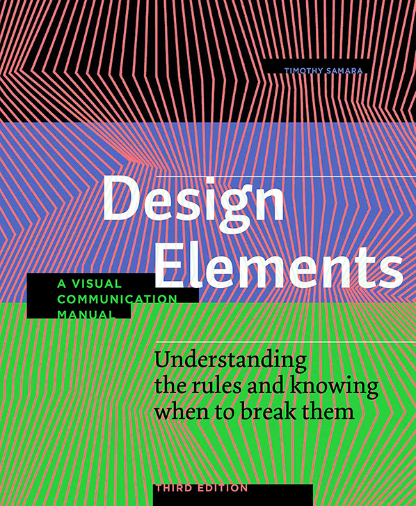
Design Elements: A Visual Communication Manual by Timothy Samara
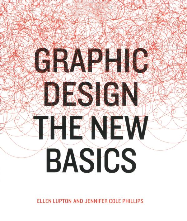
Graphic Design: The New Basics by Ellen Lupton and Jennifer Cole Phillips